Logo feedback

  • John Schultz
    Inactive
    Portage, WI
    Posts: 3309
    #1504715

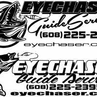
    Working up some new logo graphics and looking for feedback. I personally like the top one, even though the fish looks more like a musky than a walleye. Not sure that really matters. Main use of this graphic will be signs on the side windows of a truck topper, and possibly business cards. I figure who better to ask for opinions on fishing graphics than a website of fisherman.

    Attachments:
    1. logo-options.jpg

    mark-bruzek
    Two Harbors, MN
    Posts: 3839
    #1504732

    I like #2 better because it is a realistic fish and well, a walleye.
    Also the website is easier to read, I for one research before I buy and if I can see the website better I am more likely to go to the site.

    big_g
    Isle, MN
    Posts: 21849
    #1504742

    another vote for #2

    Timo i
    Posts: 124
    #1504748

    3rd . . .word of mouth!

    dougie
    Sobieski,Wi
    Posts: 454
    #1504758

    #2

    ______________
    Inactive
    MN - 55082
    Posts: 1644
    #1504760

    #2

    Denny O
    Central IOWA
    Posts: 5719
    #1504763

    2nd here 2

    deertracker
    Posts: 8967
    #1504765

    I like the fish in the first one but the font of the second.
    DT

    Hunting4Walleyes
    MN
    Posts: 1552
    #1504773

    #2 Here because of the fish and I’ve never been a big fan of the double outlined font.

    eyecatchum
    Milwaukee WI
    Posts: 270
    #1504782

    #2 here as well. Just easier to read more than anything.

    Fisherpaul
    Posts: 214
    #1504787

    #2 here also Easier to read.

    John Schultz
    Inactive
    Portage, WI
    Posts: 3309
    #1504810

    Thanks guys. The first three people I showed it to all said #1, but the tide has turned heavily to number 2.

    PB2
    Posts: 329
    #1504820

    #1….but i have to ask do Muskies really eat all of the panfish out of the lakes they are in?

    Art Green
    Brookfield,WI
    Posts: 733
    #1504831

    #2 but I like the Guide Service font in #1 Better.

    Jon Jordan
    Keymaster
    St. Paul, Mn
    Posts: 5605
    #1504835

    Most topper windows are tinted, so #2 will stand out better.

    -J.

    Chuck Melcher
    SE Wisconsin, Racine County
    Posts: 1966
    #1504840

    I agree with Art…. the second one, using the slanted and different font of #1…. best of both layouts. The clean easy to read portions of the second option, with a little dress up of the slanted font.

    Gary Sanders
    Lake Wisconsin
    Posts: 434
    #1504878

    I agree with Art & Chuck – Combine the elements of both previously mentioned.

    munchy
    NULL
    Posts: 4668
    #1504934

    The fish of number one because it draws your eye to it, and the text of two.

    Randy Wieland
    Lebanon. WI
    Posts: 13297
    #1505027

    John, is this logo for the truck & boat? If so, do a mock up and step back a ways and take a good look at it. I see a lot of different guys that have some cool looking Logos…that you can’t read at 20 feet away. Just make sure the font style and size is right. Both look good!

    bassn7
    Bruce,WI
    Posts: 776
    #1505247

    I like the font in #1 better but the fish in #2
    Stan wave

    mxskeeter
    SW Wisconsin
    Posts: 3578
    #1505443

    I vote for #2.

    biggill
    East Bethel, MN
    Posts: 11297
    #1505479

    #1

    I vote for your avatar but I still vote for #2 overall.

Viewing 29 posts - 1 through 29 (of 29 total)

You must be logged in to reply to this topic.